
Visual composition is, at its most basic the arrangement of elements within an image according to established art principles. Understanding these principles and being able to use them correctly is a key element in developing your professional skill level. For this blog post about visual composition I am reviewing it as a result of a very helpful industry took/workshop.
Visual composition is a key principle that needs to be correct and present in every image that we create. In the past I would just point and click with my camera not thinking about how the image would look if I took the photo from another angle or position. Also when I used to draw seems I didn't think about the points of interest or even vanishing points.
Since being a university I have learned to think more about my sketches since learning the principles and the skills of drawing. The principles of organisation; as an artist I need to decide where my centre/focus points should be in my image. I have to decide where the eyes look around the image. I do this by placing objects in certain places: I can change the feel of an image with a simple change of the viewpoint.
Here is a list of some of the principles of organisation:
· negative space
· colour
· cropping of an image
· shape and proportion
· positioning/orientation/balance
· the contrast
· lighting
· perspective
· lines
· geometry
· Harmony
· Rhythm
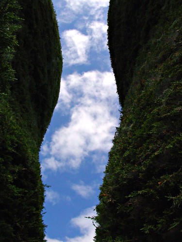
The negative and positive space should balance each other out. Negative space is commonly seen as a black background like in this image.
The colour theory is very important in visual composition because if you get the colour wrong it can throw and overpower the overall image off.
The rules of thirds is where you divide the image into three sections wide and three sections in height using these guidelines you can create a pleasing image by moving the horizon line to one of the gridlines also meeting key aspects into the bottom left that creating spiral effect.
Being human we have a certain curiosity with other people. So in this photo everybody's eyes would go straight to the people. Faces and particularly the eyes will pull the viewer’s gaze in more.

Sharp areas will draw the viewer's eyes in over the out of focus areas. This is these same with diagonal lines as they are more of fierce than the horizontal lines. The diagonal line can be strong or weak, with a stronger line the image would be more dramatic and dynamic also the diagonal line takes the views I straight to a specific point of view. This is quite forceful and as I've said dynamic. Using a C or S line can take the viewers are you around an image deselected areas.
In mathematics and the arts, to quantities are in the golden ratio if the ratio of the sum of quantities to the larger quantity is equal to the ratio of the larger quantity to the smaller one. It is believed that Leonardo da Vinci used the golden ratio in his paintings but there have not been any recorded evidence. When looking at the Mona Lisa it is being suggested that the proportions use the golden ratio.
No comments:
Post a Comment